Improving User Experience
21 February 2023
Upcoming changes to the web client and Employee Self Service modules are aimed at improving the user experience as well as simplifying the management of corporate identity across employee accessed systems.
Request a call
If you would like more detail about People Inc., we can ask one of our team to call you.
An important consideration when updating our software was how it could be used to bring in direct benefits to its users and our clients overall. The computer screen can be used deliver benefits beyond just displaying data.
Software systems and biophilic design are not usually considered within the same breath. However, there is no reason to ignore that the user interface for the software system will be displayed on devices that exists within a larger environment. There is a part we can play in complimenting a design scheme.
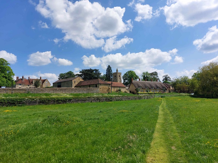
P&A software are based in the city of Milton Keynes. In addition to concrete cows, roundabouts, and red ways the city provides its residents with over 6000 acres of parkland around the city. For those living and working here it is difficult to ever be far from nature and the benefits it can bring.
Biophilic design is the proper name for the concept of designs which considers how nature can be used directly and indirectly to benefit people. Within a city the concept may be expressed through parkland (as in Milton Keynes) and grass verges, within an office it could be an office plant, a living wall or glass atriums. In can also be achieved though indirect means such as displaying images of nature.
Within the workplace simple touches such as including plants in an office environment have been shown to increase productivity and employee wellbeing. The reality is that this is not so easy to achieve. Commercial space is typically designed to maximise floor space whilst minimising build and maintenance costs a likely contradiction to the priorities of the occupier who may well want to prioritise productivity in order minimise the required floorspace (and its costs). Land value and maintenance costs also makes the inclusion of meaningful outside space in such schemes less likely.
Acting primarily as a software vendor it is safe to say that there is certainly a limit to what we could do to help promote biophilic design. The important thing we must consider is that does not mean that there is nothing we can do.
Our Web Client and Employee Self Service module provides a blue based colour scheme by default. That said an important feature is that the systems can be matched to a clients corporate branding; a client has complete control of CSS properties and can add their own logos or images.
Our employee self service will be seen and used by every employee in a company. It will at some point be displayed on almost every computer screen within an office. It will be a part of that environment, even if fleetingly, so we can and should try to have a positive impact if we can.
It is not, for example, an accident that the primary colour used on this site, our logo and products is blue. Blue is the colour of water and the sky, a core colour of nature. It is known to be a colour which people find to be relaxing and soothing. We could also have selected green as it has similar qualities however surveys tend to put blue as the top colour.
The obvious place to begin when considering this in the updated web client and ESS was the entry and exit pages which most users will encounter. It would be fair to note that many clients use the single sign on component allowing them to skip the initial log in page entirely; however, to enhance privacy in these systems users will (also be) automatically be logged out through inactivity, so these users will still see these pages from time to time.
We are all inevitably very familiar with logging into websites and devices and often miss how the initial pages are subtly engineered to help us navigate our interaction. A typical example may be the actual button which says login; we will intuitively recognise that buttons with a similar look and feel encountered through the interaction with the system will perform important functions.
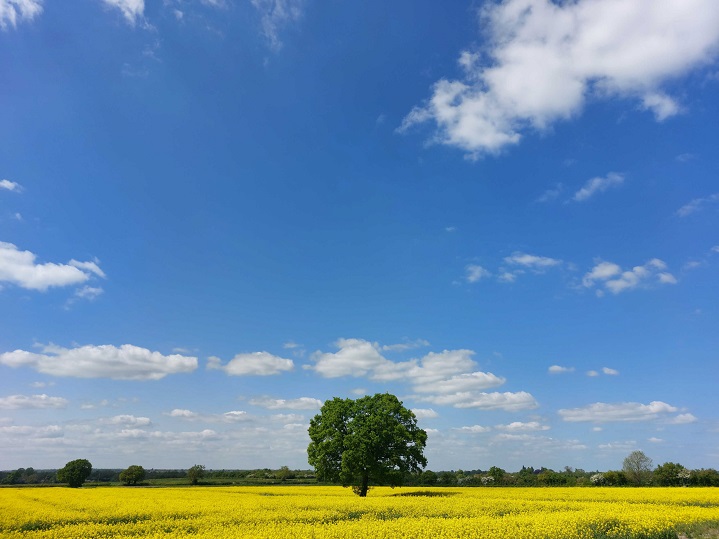
In the background of these pages there is an opportunity to use in-direct nature in the form of images. These pages suite this as they feature a single activity; this means the user is less likely to find the inclusion of a background image distracting. So that is exactly what we have done. As standard the updated version of the web client and ESS will include over a hundred background images for these pages. The system will randomly select an image from this pool when a page is accessed.
We have provided images which have mainly been taken not too far from our offices, as well as some from further afield. There are also a few which feature landmarks and engineering (as we have many engineering firms which use our Time and Attendance software and wanted to include something for them).
A technical consideration with images has been to balance quality with file size. This is a difficult balance to strike as the nature of the way the images are used means they need a reasonably high resolution (we have chosen a width of 4000 pixels). This will generate a large file so to help with this the images have a much-reduced quality (approximately 30% of the original images). This work was done using an open source / free to use photo editing tool. We will keep trying to optimise this and currently the image file sizes range from around 1.5mb at the extreme down to 250kb. The original images will have started at around 20mb in size.
A primary reason for using images from around our office was to reduce generating costs (which would need to be passed on to clients). This meant that our staff could take the photos on their phones and submit them without needing to buy costly commercial licences to distribute the images (we are distributing these images for use within our system only, with copyright retained by the image owner). A client could choose to take a similar approach to populate their own library of images from staff contributions which reflect their local area or workplace.
The intention is that a client can choose to use a selection of these images (or all of them) in their system. They can also replace the images with their own set. They can also turn them off and have a static background colour or image of their choice.
As well as bringing an improved aesthetic to the system this functionality also provides an additional opportunity to further match up with corporate branding and corporate websites by using images taken from these locations or provided by the marketing department. The web site styling will apply an appropriate colour overlay to the images to help retain the content of the image but prevent it masking the main colour elements of the site.
As standard once logged into the system the background will revert to a single colour background so as not to be distracting. This is again entirely configurable so an image could be included as a background here as well. When we trialled this our opinion was two parts; firstly, that the content of the pages masked most of the background image and secondly that curiosity to try to understand the obscured image distracted from the activity on the page. For these reasons we have opted to keep the background plain where users will be performing more complex activities and want to avoid distracting design elements.
Part of the work in the latest version of the Web Client has been to provide increased control over styling and layout to help clients designed a seamless corporate experience for employees when switching between systems.

This has provided some technical challenges. An example of this is selecting the colours that should be used to display different types of absence in our absence calendars. A computer monitor can typically display approximately 16.8 million colours (although the quality of the display and the limitations of human sight mean these will not all be distinguishable from one another). With such a range available there are various options and notations which can be used to describing a specific colour to a computer. To keep the interface simple for a user we limit the choices to a simple set which is intuitive to understand.
This is all well and good for the user but does not help when needing to match the calendars look and feel with a corporate identity. For example, there is a need to let a user choose red from a list of colours and have red mean the same red as is used within corporate branding scheme.
Previously our calendars took an industry standard means of translating a colour name to a display colour. This has been updated to allow the translation of the colour name to be defined within the sites style sheet.
This also provided an opportunity to tweak how intensely the colour would be displayed to a user; by default, we have chosen to slightly reduce the intensity of colour in the calendars to help deliver a more calming aesthetic. This strikes the balance of providing an improvement without breaking any existing client colour schemes. This is shown below.
The colour used by each bar uses the same colour code (navy blue) but the alpha value (how transparent the colour is) is gradually reduced. When placed over a white background this allows the intensity of the strong colour to be reduced without needing to change the actual colour which has been selected.
This update to the web client and ESS will be available later in the year and include a variety of additional features and changes.
Receive regular product updates by subscribing to our newsletter.
News Index
- Wizard Pack 4
- Access to Attendance Records
- Resource Planning
- Managing Competencies
- Self-Service Update
- Managing Tasks and Actions
- System Health Check
- Manage Salary Reviews
- Online Statistics
- Reporting Update
- ESS Scheduler
- Employee Directory update
- Training Matrix feature
- Partner Conference
- HR Policy Sign-off
- Company News Feature
- Software Clock
- People Inc. v4
- Absence Update
- Working with Partners
- Staff Assessments
- Features Browser
- Hints and Tips
- People Inc. Webinars
- Org-Chart update
- Wizards and Plugins Update
- 2018 People Inc. Partner Event
- Report Browser
- Mail Queue Manager
- Absence Wizards
- Software for HR
- On-line Payslips
- Custom Appraisal Forms
- Recalculate Data-Screen Wizard
- General Data Protection Regulation
- Training Wizards
- Manage Leavers
- New People Inc. Wizards
- Departmental Timesheets
- People Inc. 3.6
- Staff Timekeeping
- Social Mobility
- Employee Directory
- On-line Appraisals
- Expense Claims
- Organisation Charts
- Recruitment Web Publishing
- Company Statistics
- New Web Client
- Pay Review Process
- Driving Incidents
- Payroll Change Log
- People Inc. in the Cloud
- Employee Self-Service Customisation
- Delete Records
- New user training events
- People Inc. version 3.5 released
- Annual People Inc. Partner Event
- Report Writer Training
- Dealer Conference
- Charity automates standard HR tasks
- Pension Auto Enrolment
- Improving User Experience
